
Integrating Circularity in Education at Universities
A research group of the Faculty of Architecture and the Built Environment of TU Delft is working on the integration of education about circularity in their programmes. Therefore they needed a website to provide educators with content on either circularity or pedagogy for and about circularity. Additionally, they wanted a platform for their community of educators to share their experiences and insights, and exchange about them.
Contribution
Workshop Facilitation, UX Design, UI Design
Year
2022 – 2023
Client
TU Delft
Approach
Engage stakeholders through co-creation
Our approach was lean and focused on open communication with the client and stakeholders throughout the process. Regular meetings were held to ensure that we had a clear understanding of the needs, and the client of the project’s progress and to further allow for quick adjustments based on feedback. This approach helped us to align the project’s goals and expectations, ensuring that the platform was designed and developed in the most efficient and effective way possible.

Solution
Circularity for Educators
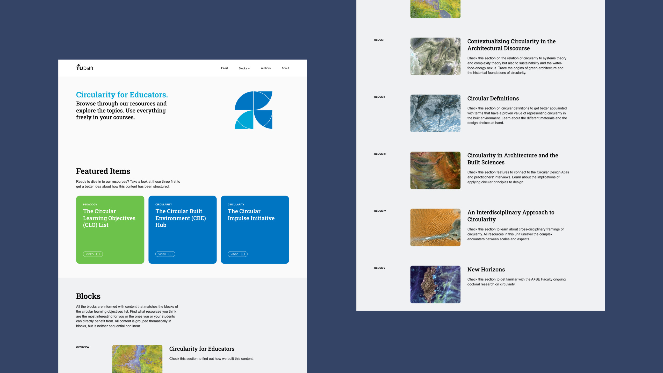
The challenge for the “Circularity for Educators” platform was to seamlessly integrate the diverse contributions of Faculty of Architecture and the Built Environment professors and researchers into a cohesive and accessible resource. A main objective was, to present the content, that is grouped thematically in blocks, in a way, that makes navigation and discovery easy. Furthermore, it should foster engagement and understanding for educators, empowering them to seamlessly integrate these principles into their teaching practices.
The design was centred around simplicity and user-friendliness. Understanding that the platform would be used by educators from various backgrounds, we kept the interface as straightforward and intuitive as possible. This ensured that users could navigate the platform with ease, regardless of their level of tech-savviness.

Solution
Educators for Circularity
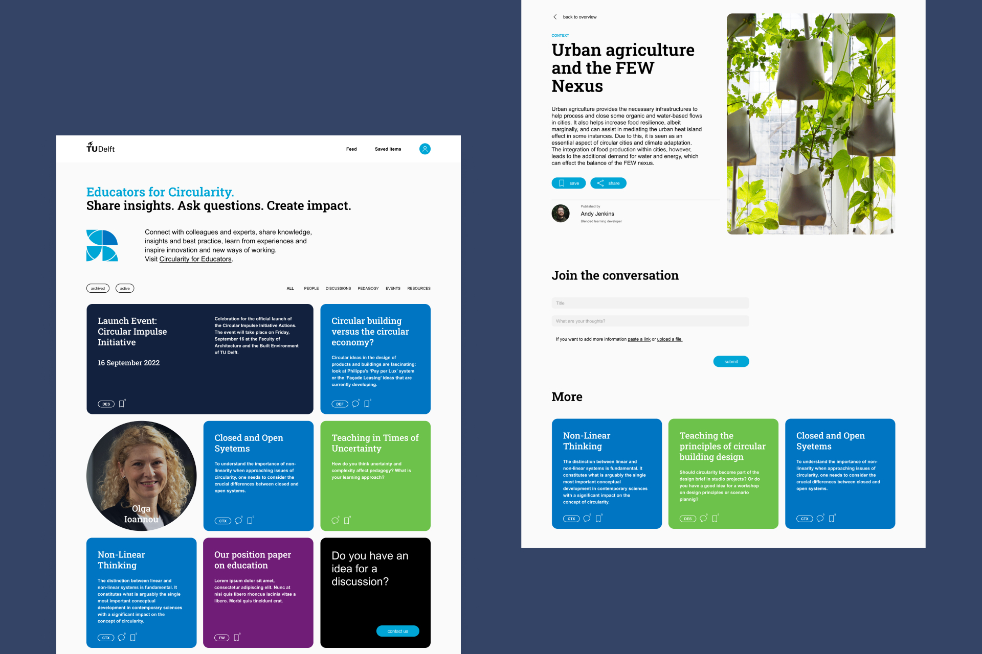
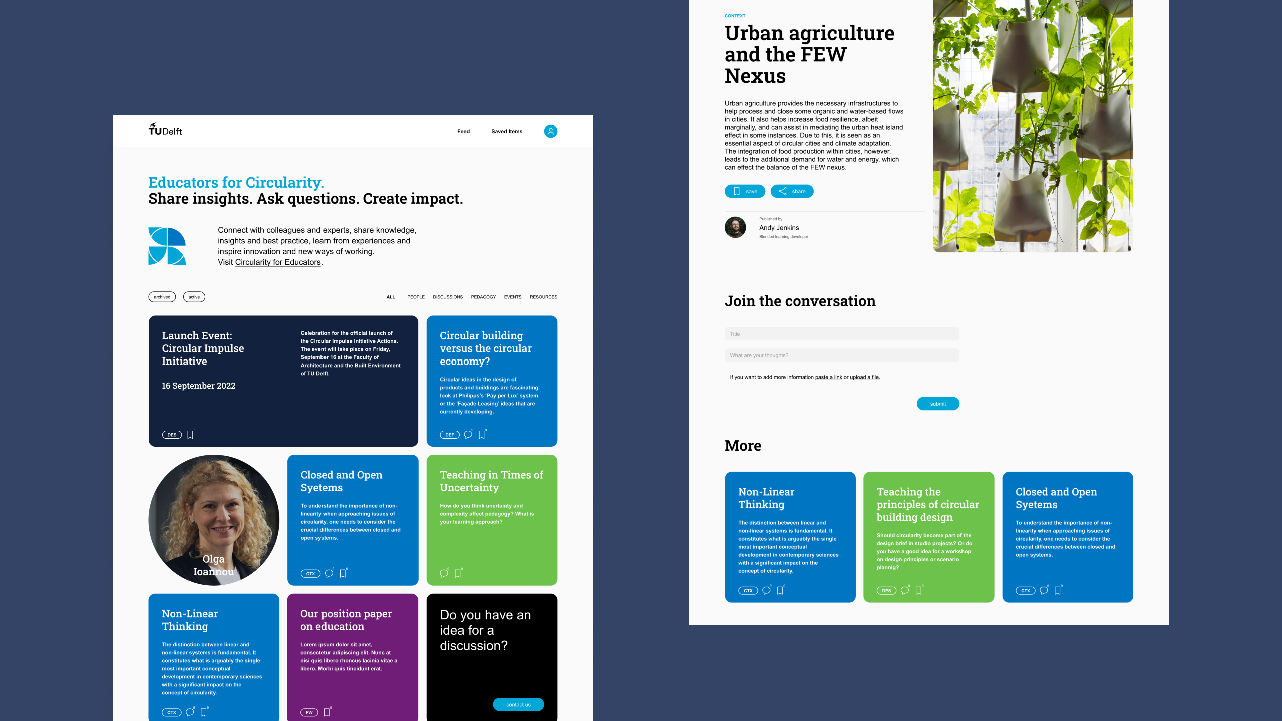
Working closely with the group of TU Delft, we defined the functionalities of the platform, with a focus on designing interactive discussion spaces where content would be shared. The goal was to facilitate the sharing of experiences, particularly regarding pedagogically valuable activities, and foster a collaborative learning environment among users. The design needed to encourage collaboration and knowledge exchange among educators while providing a scalable solution that can adapt to the evolving landscape of circularity in architectural education.
To make navigation as easy as possible, we implemented a colour-coding scheme for different content types. This visual cue makes it quick and easy for users to identify the content they are interested in. Whether it is a discussion thread, a research paper, or a lesson plan, users can easily distinguish between them. This also added a vibrant and engaging visual appeal to the platform, making it more enjoyable to navigate.
2022 | Studio Vi
