
EAACI's digital transformation for enhanced interaction
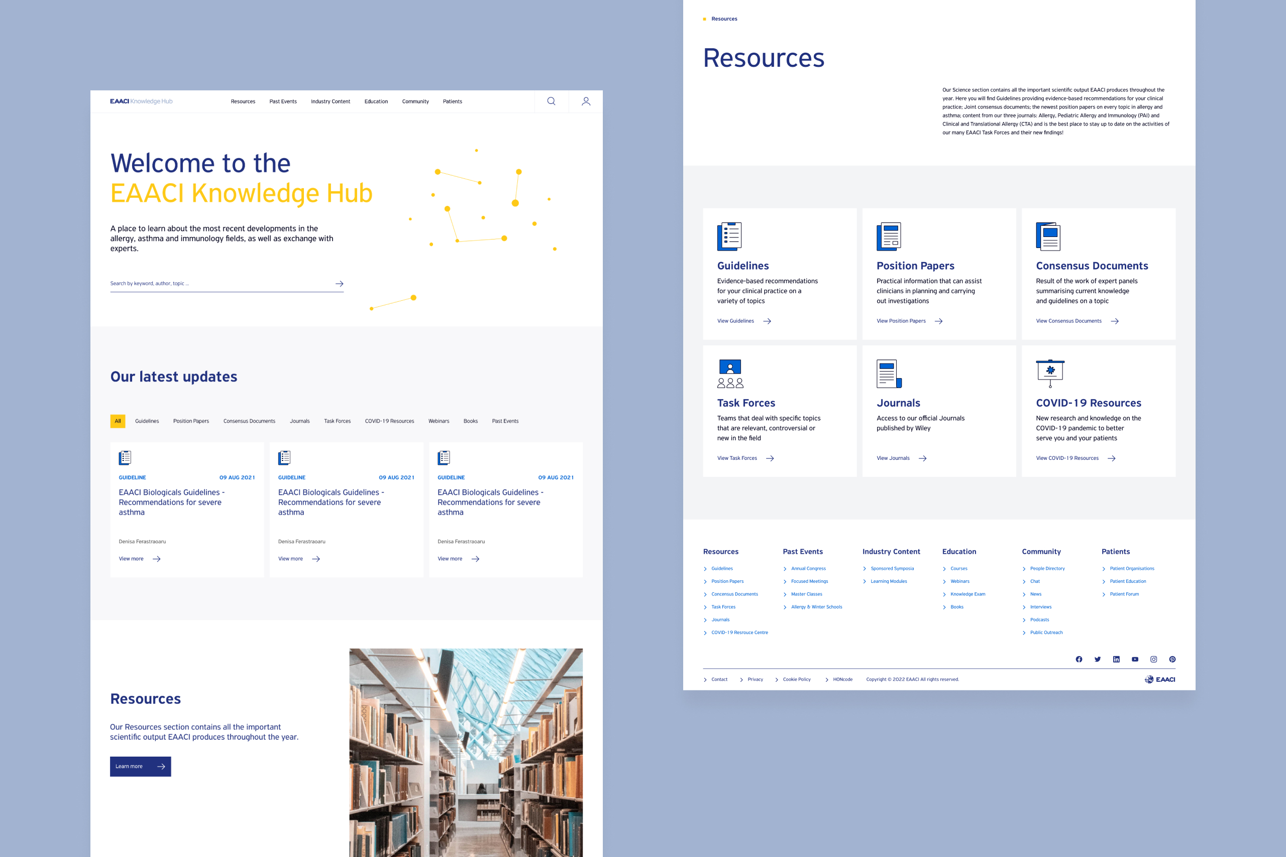
EAACI, the largest European association for allergy and immunology with more than 12,000 members, faced challenges due to diverse stakeholders, limited communication, and a complex, outdated website. The goal was to create a new website facilitating scientific communication and education. The outcome included a revamped corporate website showcasing events and a Knowledge Hub housing comprehensive scientific resources.
Contribution
Digital Strategy, UX Research, Workshop Facilitation, UX Design, UI Design
Year
2022
Client
EAACI
Website
EAACI's digital transformation for enhanced interaction
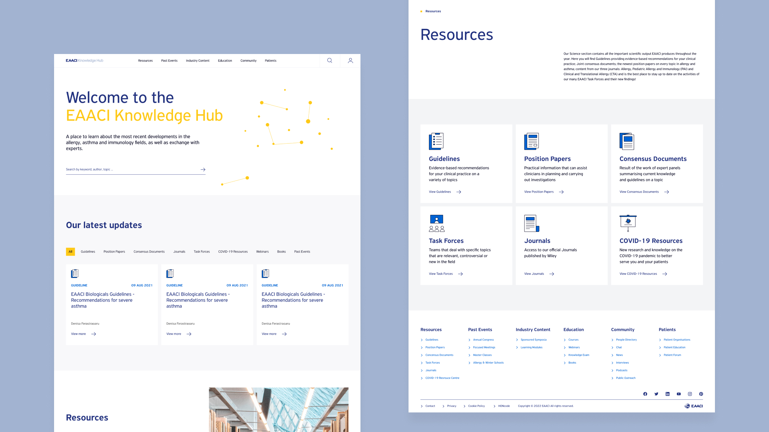
EAACI, the largest European association for allergy and immunology with more than 16.000 members, faced challenges due to diverse stakeholders, limited communication, and a complex, outdated website. Together with my team at Studio Vi, we redesigned their website and created an additional platform, The EAACI Knowledge Hub, facilitating scientific communication and education.
Contribution
Digital Strategy, UX Research, Workshop Facilitation, UX Design, UI Design
Year
2022
Client
EAACI
Website
Challenge
Untangling complexity in a content heavy website
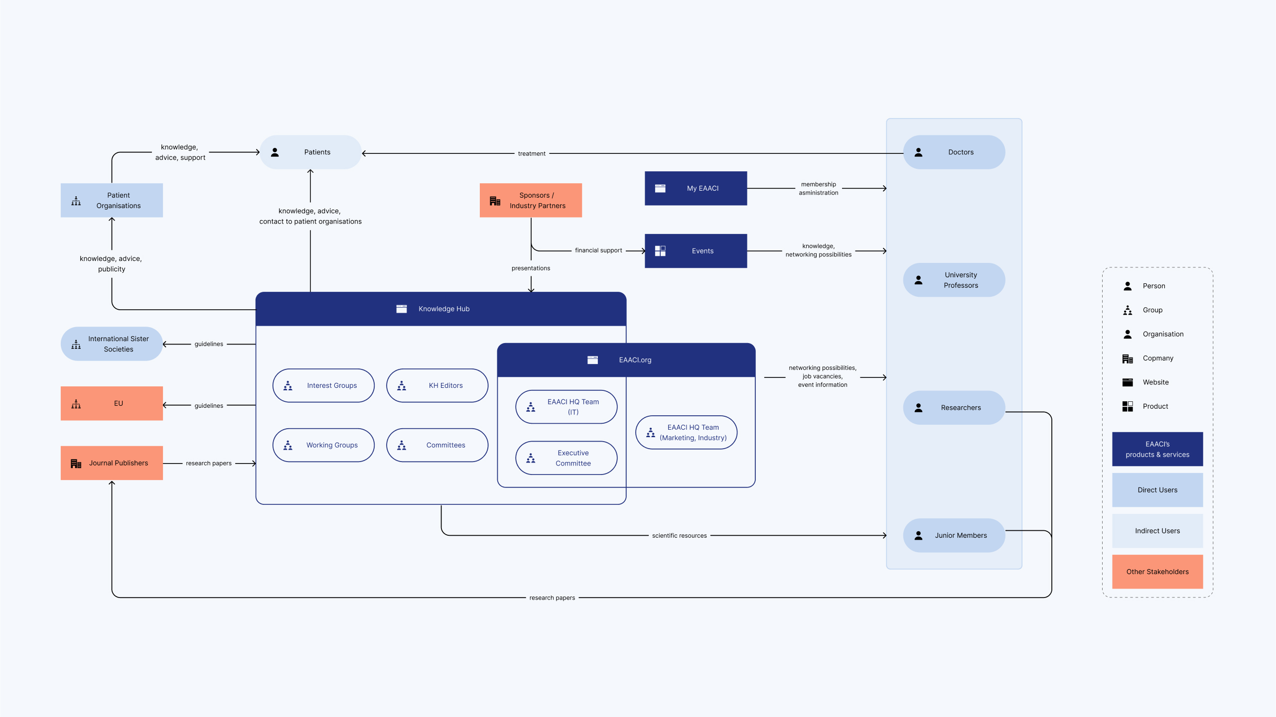
Due to EAACI’s non-profit nature and involvement of numerous stakeholders, multiple content editors with diverse focuses contributed, leading to a content-heavy website lacking organisation and clear structure. This cluttered and unstructured environment posed challenges for users in locating specific content they needed.
To address this, I facilitated various workshops to gather insights and collaborated on restructuring the content, improving the navigation, and giving the website a branding facelift as part of our comprehensive solution.
Restructuring of the sitemap with the stakeholders
Approach
Streamlining stakeholders in collaborative workshops
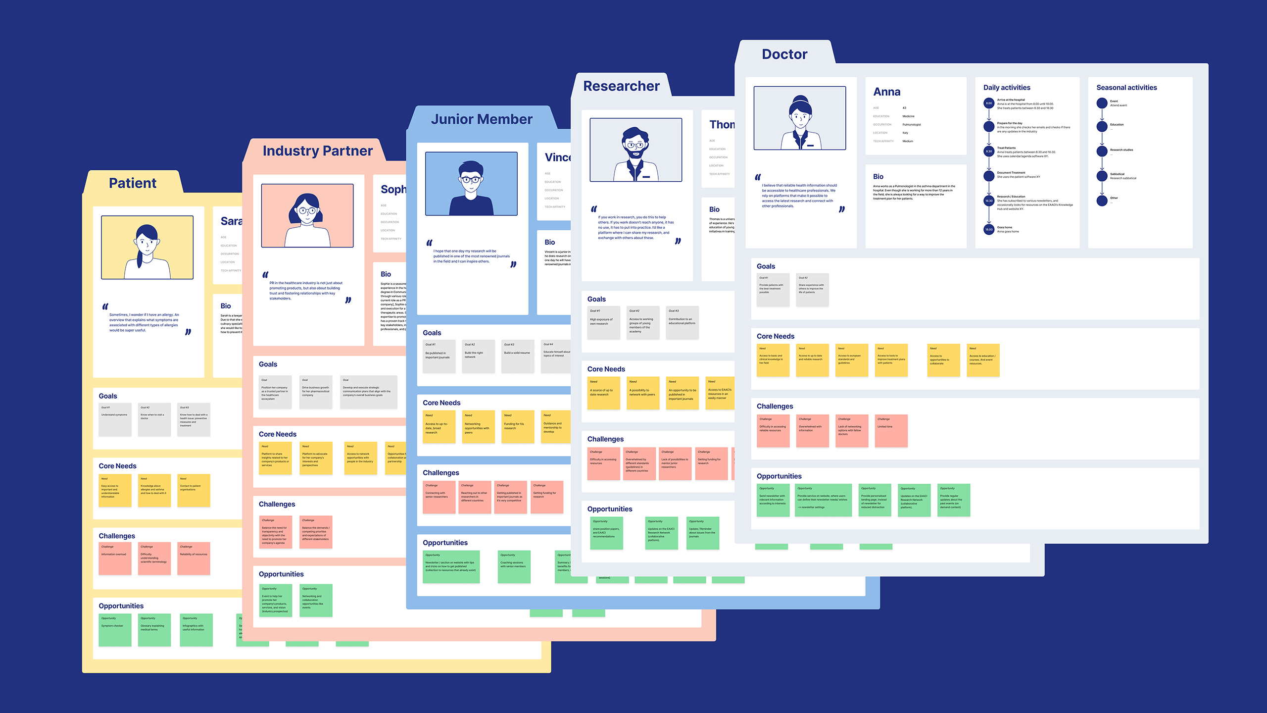
Facilitating interactive workshops involving stakeholders, I led a collaborative effort to gather insights. Through engaging discussions and iteration sessions, our collective focus extended to strategically restructuring content, refining navigation. This comprehensive approach ensured that stakeholders not only feel involved and heard but are also well-equipped to navigate the changes seamlessly and make the most of the improved user experience. While creating the two products, we gave them a refreshed look, expanding upon the brand identity, to further enhance the over-all user experience.
Solution
Optimising user navigation through improved information architecture
After reorganising the content and creating a new information architecture, we made a strategic decision to connect the two websites, enabling seamless communication between them. By implementing a search functionality that queries both websites, users now enjoy a comprehensive view of relevant content. To further refine results, we integrated customisable filters. This user-friendly approach simplifies access to specific content, aligning with individual requirements. Post-launch analytics notably revealed that the most visited page is the search, confirming its central role in enhancing user engagement.
The connected search queries both website and knowledge hub content
Design
Simple design language
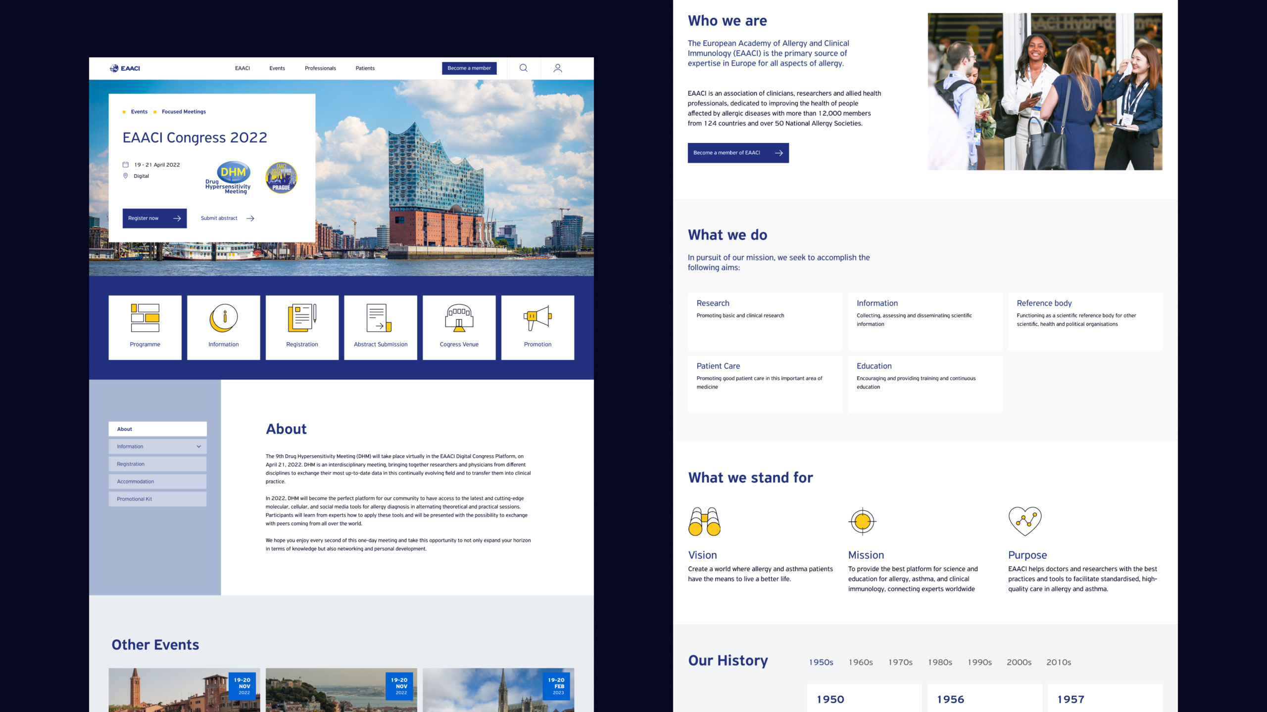
We expanded upon the established brand identity by incorporating EAACI’s primary colours, blue and yellow, and defined their use further. Blue was chosen for the resource icons in the Knowledge Hub to convey trustworthiness, while yellow was utilised for patient and website icons to symbolise positivity and curiosity.
Impact
Enhanced user experience
With the implementation of a new navigation system, the capability to search both sites seamlessly, and a minimalist aesthetic, both platforms now provide users with a significantly improved and more user-friendly experience.
"I had the pleasure of working with Miriam when she was part of the Studio Vi team, and her work was truly exceptional. She delivered stunning designs for our corporate website, showcasing her clever approach and keen understanding of client needs. Miriam is not only a talented strategic designer but also a wonderful person to collaborate with—always polite, professional, and quick to grasp the vision. Her attention to detail and ability to translate ideas into beautiful, functional designs made the entire process seamless."
Charalampos Kostaras, IT & Development Manager
2022 | Studio Vi
